The current process for buying concert merchandise
To get a sense of the current experience in buying concert merchandise, we explored 10 different articles and reddit posts and found 4 common problems fans face.


Competitive analysis
We looked into existing interactive kiosks to understand how they addressed the product vending experience.
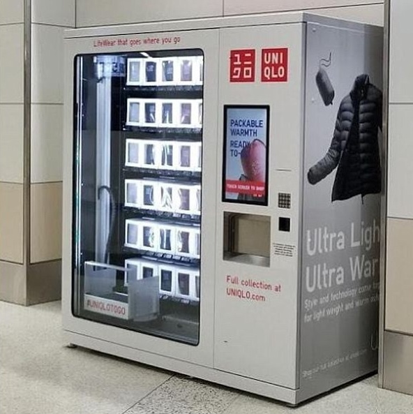 Uniqlo Vending Machine
- Limited selection of item (best-selling items only)
- Displays products in a compact box
- Offers steps to selecting an item (color and size) before adding it to cart
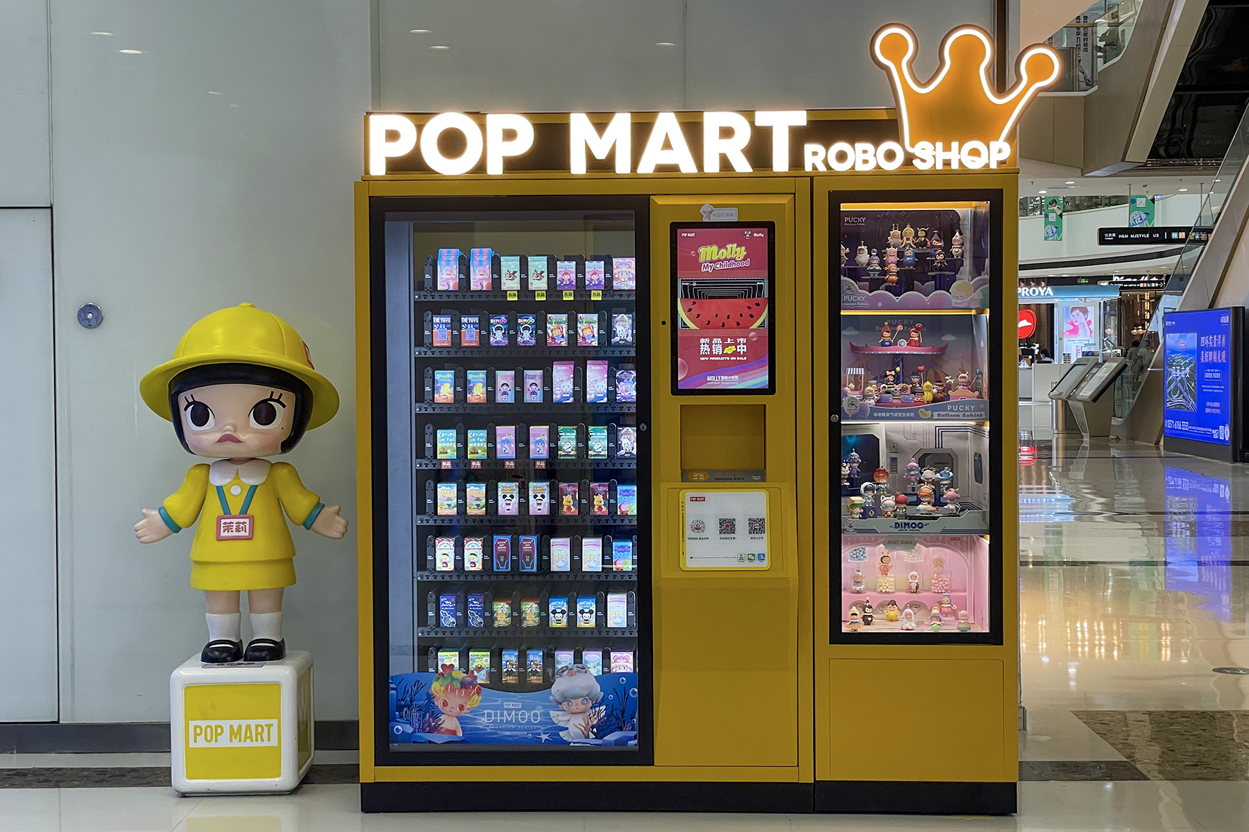 Popmart Vending Machine
- Provides in depth information on each product
- Displays selected figurines for people to see
- Does not allow the user to pick a specific unit, unlike in store. This is important since each box has a different figure inside.
 Benefit Vending Machine
- Includes list of all products with rating
- Detailed product description
- Can’t tell if product is out of stock from the homepage
Field Observations
For our fieldwork, we observed 1 concert merchandise line (Sabrina Carpenter's Short n’ Sweet Concert @ Chase Center San Francisco), and 3 interactive kiosks (Popmart & Benefit Vending Machine and Uniqlo self-checkout). Observing the concert merch line was helpful to understand the built enviroment and the target audience for our kiosk. While observing kiosks gave us a better sense of how people interacted with product-dispensing kiosks.
| Concert line | Kiosks |
|---|---|
Average transaction time: 5-8 minutes.
|
Average transaction time: 3 minutes
|
| 2 hours before the concert, the line was roughly 45min-1hr | Having multiple kiosks helped long lines move quickly (Uniqlo) |
| Decided on what item to purchase quickly since the products were displayed | People were able to quickly view whether a product was in stock (PopMart & Benefit) |


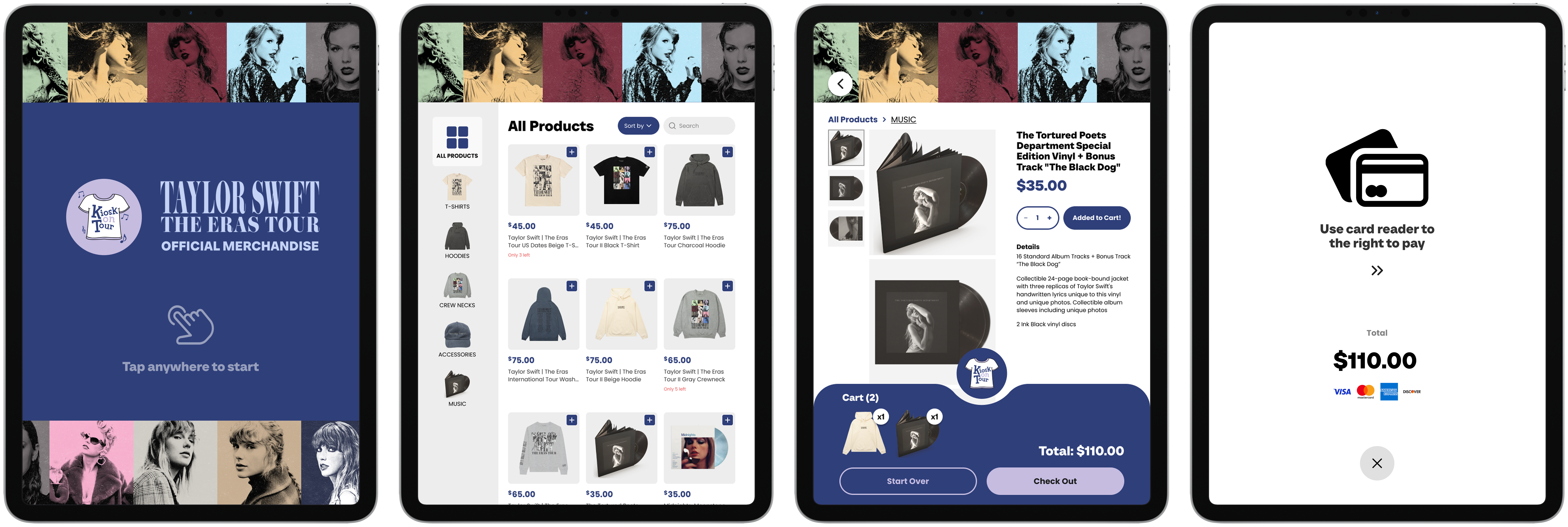
 Lo-fi prototype
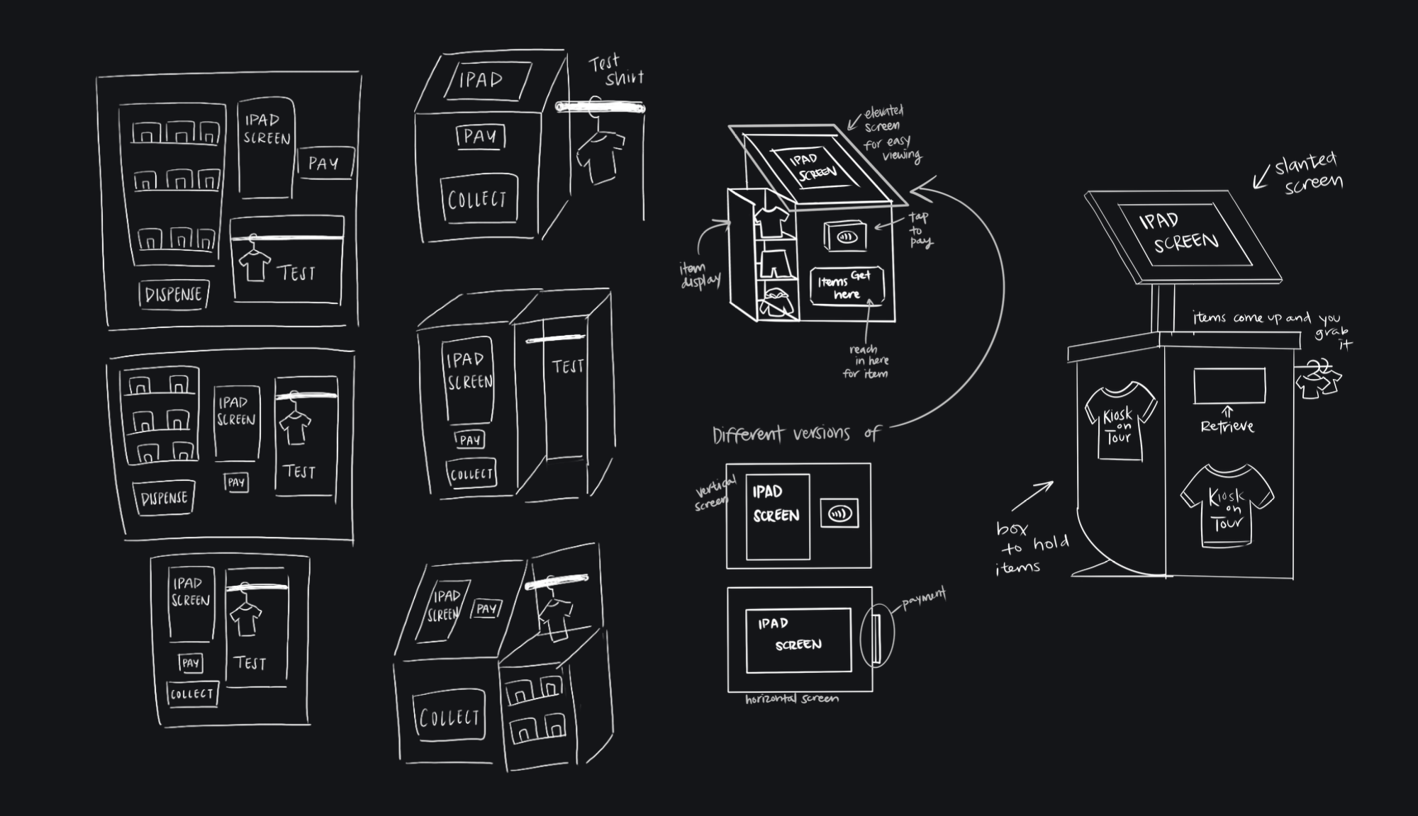 Physical kiosk sketches
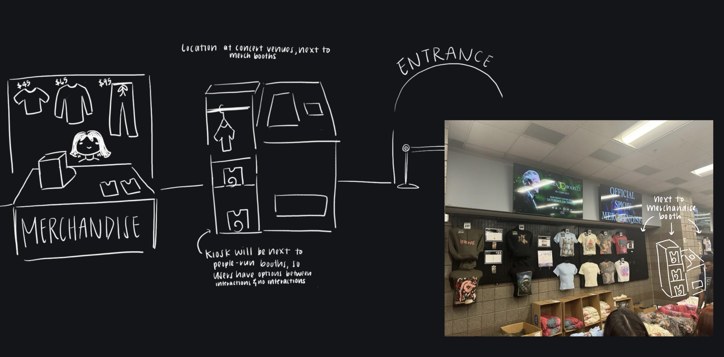 Physical kiosk environment
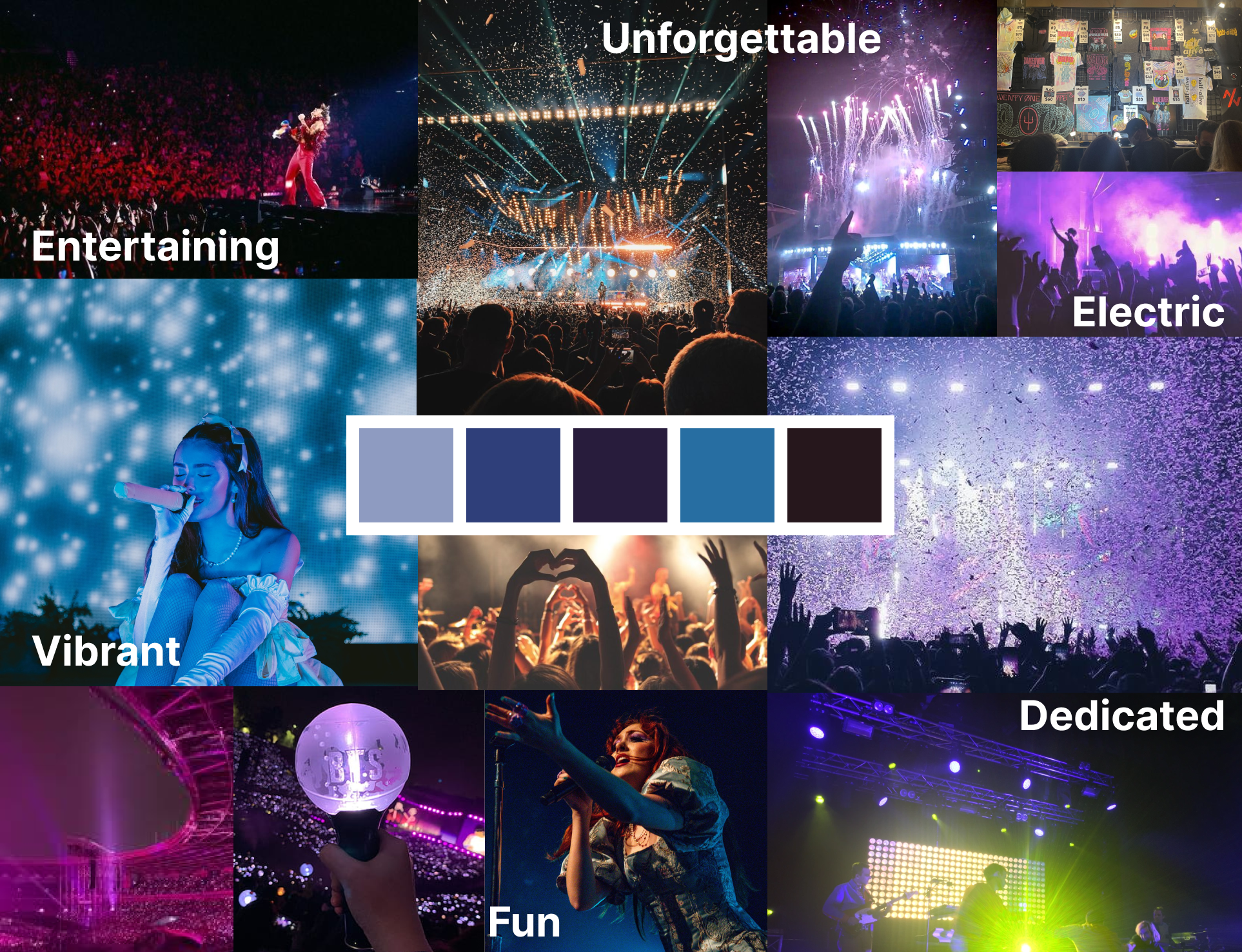 Moodboard
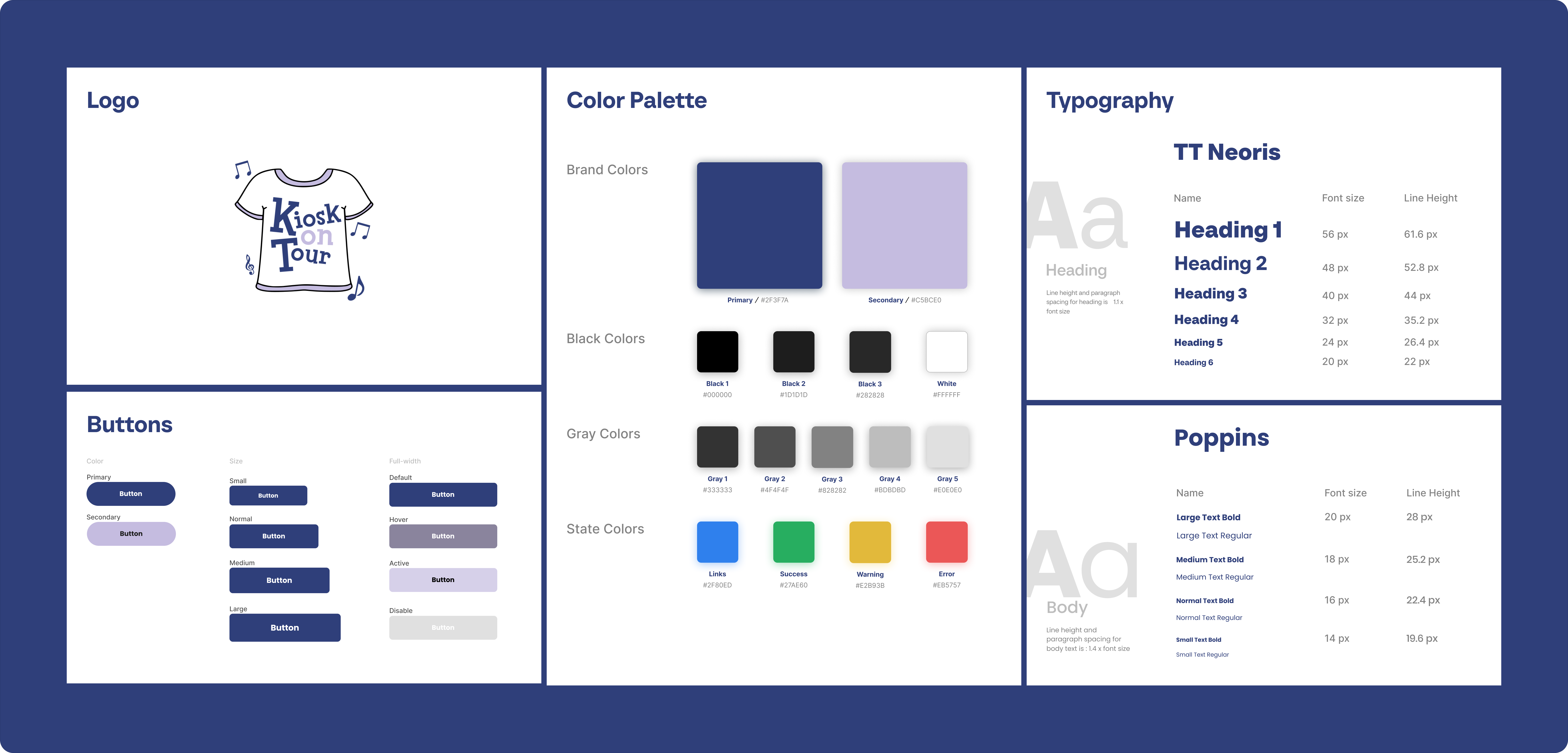 Style Guide
 Hi-fi component sheet
 User flow
 Physical kiosk set up
 Physical kiosk set up
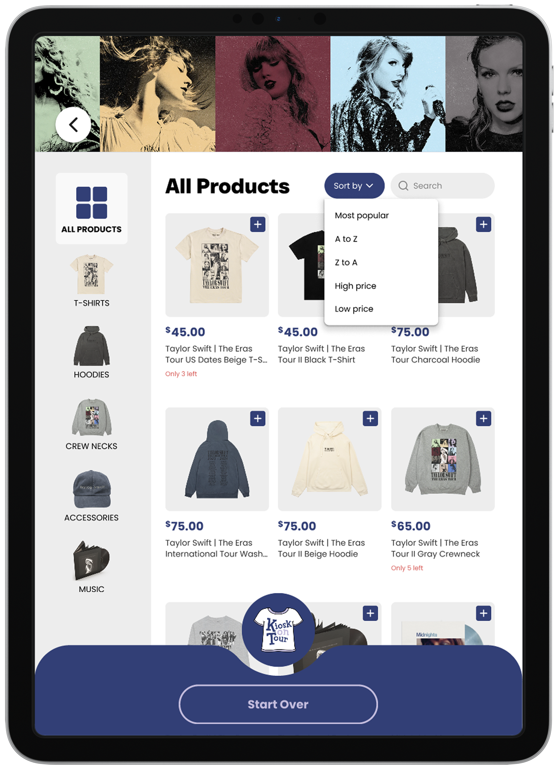 Sort feature